Sunday, April 25, 2010
Wednesday, April 21, 2010
Art Space Seogyo. Contemporary Korean Artist
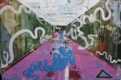
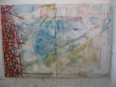
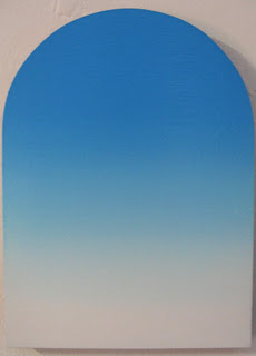
Seoul Art Space - Seogyo (서교예술실험센터) put up a show of some pretty interesting Korean artists in the summer of 2010. SAS-Seogyo is somewhat of an odd space - it is housed in a nondescript building; the main floor space seems more suited for a restaurant, with its patio area, desk by the front door, and kitchen stall at the back. There is more gallery space in the basement, and studios on the floor above. The belies the fantastic art the gallery contains.
I have no image of another
Saturday, April 17, 2010
Monday, March 09, 2009
Holly Ward - touching on Relational Aesthetics
Holly Ward was born in the seventies and studied art in Nova Scotia and Ontario. She currently lives in Vancouver and her work has been exhibited in group and solo exhibitions across North America and Europe.
Ward is an interdisciplinary artist, who works with drawings, sculpture and multimedia installation. In her work, she is constantly questioning accepted notions, whether they are concerned with social progress and political power, or the transformational aspects of materials. Island (2005) consists of a mound of dirt heaped on the floor of the Gallery. This mound is moved around by staff and volunteers on a regular basis, leaving a trail of dirt in its wake. Ward is challenging the conventional notion of an art object as static and contained. Her drifting pile of dirt is constantly seen in relation to new works of art, and the viewer is asked to consider this ever-changing set of visual relationships.
from the VAG Teacher's Guide to the exhibition, "How Soon is Now"
Tuesday, February 24, 2009
Another RCA painter – James Bowyer
Light will be entering the top floor studio space from above for one more year before the Stevens Building and the Painting department it contains moves to the new Battersea site this summer. Design is popular at the RCA, and brings in big foreign-student rates, so the building will be refurbished to allow that programme to expand.
But I digress. This light, usually thinned during my visit by cold winter rain and snow, I share with James Boyer, one wall west of me. James seems to live in the studio; in there early, leaves late. He looks to the whole Leipzig/ Neo-romantic stuff for inspiration, and individual artists like Jules de Balencourt.
Industrial decay he takes as a subject, but it is the paint that really dictates his direction. Works get painted all the time, then buried under a new work, much the way a factory may see many businesses before one finds success and sticks: remnants of the failures remain as an obscured base upon which a winner is finally constructed.
The paintings are not titled. The last few works are quite small.
need more? Other works of James' can be found here, in the monster Saatchi site.
Monday, February 23, 2009
Artist Talks - Robin Footit
installed - title unknown
The snowday a few weeks back has out the second years at the Royal College of Art behind on their artist talks. I managed to sit through two of four before deciding to go write about Robin Footit's work while his talk is still fresh in my mind.
Footit began his talk with a Rene Lalou film, "How Wang-fo was Saved", introducing the audience to a King raised in complete seclusion, his only contact with the world outside being his father and a large number of scroll paintings, done by the famous artist, Wang-fo. On his 16th birthday, he was released from his prison, only to discover that the real world did not measure up to the one presented in the works of art he had grown up with. He could never come to enjoy this world, and the disappointment it brought to his eyes at every turn. For this he planned to blind the Wang-fo, and cut off his hands, so that he too would exist in a world he could not enjoy.
Footit's work is all about what we see, how we see, and how to make us aware of our visual process. Footit's work typically consists of multiple images arranged in a space. He begins by making images - typically they are a collage of all sorts of things - that find meaning through the relationships found with other works. Self-curation to highlight visual connections usually comes long after a work is completed. Typically multiple works hang on his studio wall for some time before connections are made, or before future works are completed that highlight certain connections. The result completed works are commonly individual works hanging in pairs, situated among a larger installation. Also of concern at this final hanging stage would be how much space is a work given that invites the viewer to occupy the space.
Typical of his working process, not all work are successes, and not all failures are discarded. His attempt to turn a texture into an object is a good example: in the attempt, a bowling ball ended up cast in plaster, but could not be easily removed. The carcass of the experiment, a busted-up cast, still found a place in the work, leaning against the wall, on the floor below the paintings, highlighting a traditional artistic hierarchy of aesthetics and medium.
An example of the sort of visual trickery Footit is interested in is exemplified in the 1965 film by Richard Quinte, "How to Murder your Wife". There is a scene in this film where the main actor (look at about 2:13 of this clip), Jack Lemmon, is eyeing a dancing girl high on goof-balls, played by Virini Lisi. Behind him is a Caravaggio(esque?) painting of a young boy looking in the same direction, with the very same dreamy looking on its face. These two “looks” highlight many things, such as the Romantic idea of irony, remind the viewer that this is a production, and not real, question who is looking, and who is being looked at. This multiple read is further being expanded by Footit’s reproduction of a reproduction of a reproduction.
possibly titled, "How to Murder Your Wife".
His investigation into visual manipulation has also branched out to include how to influence a viewer's time spent in front of a work. To do this he teamed up with a group of sound artists to create a work consisting of a still image and a four-minute audio component. It is a work that benefits from having this extra time to ponder over it. What the viewer first becomes aware of is the depth of the work, and how that is often cancelled out by the odd shapes and handling of the medium that flatten space back out, reinforcing its actual two-dimensionality. After staring at the work for a couple minutes, it can become evident that there is a geometrical framework that also underlies the work, as illustrated in the sketchbook plan.
"Less Hope", minus the great soundtrack, which is approximately three and a half minutes.
“The Dark eyes of London” is one of Footit’s newer works. In it, he is hoping to create the feeling of looking through the work, as if the surface is a translucent veil that requires visual penetration. This work, in a way, reveals itself over time – a continuation of some of the concerns about duration that Footit has played with in previous works.
"The Dark Eyes of London". Spend some time looking at this work or you'll miss it!
Footit finished the presentation with footage of Wang-fo's escape from the vengeful King. Before subjecting Wang-fo to his punishment, the King kills Wang-fo's loyal aide and commands the artist to finish a scroll painting of a seashore he had left incomplete. While seeing to this task, the sea floods out of the painting and brings Wang-fo, undetected by those all around, into his painting, where he remains undetected by those that cannot really see what is right in front of them.
Saturday, February 14, 2009
White cube shows - Georg Baselitz and Rosson Crow
While I have been here, I have found two shows quite exciting for their handling of paint. Both are hosted in White Cube Galleries. In White Cube Hoxton, in the main space, is the work of Rosson Crow. A Texan of only 27, she paints large, powerful works that invite the viewer in with the idea of depth, then flatten with drips and arcing swipes that bars the way into the painted space. The show, titled Texas Crude indulges in the myths of the West - Cowboy country, big banquets, hunting, and the ever-present oil well. The work comes across as confident and proud, reflective of the artist, who has shown up at previous openings in full cabaret costume.
Georg Baselitz may be an old man, but that does not seem to prevent him from putting up a killer show. Over a dozen works comfortably fill what is one of the nicest galleries I have ever been in - White Cube Mason's Yard. The exhibition,
Mrs Lenin and the Nightingale, is simple in its imagery - Two figures sit on a couch, but, in typical fashion, are portrayed upside-down. An unpainted band greets the viewer at the bottom of the work. The image is blocked in first with colour - usually a very limited palette. The figures are loosely defined with black paint, which is applied with a thin brush overtop of the colour. This is how all the works are constructed, yet there never is a feeling of repetition. Each work stands on its own, offering intriguing and, again, confident handling of the medium. Baselitz is, I believe, plays up to his strengths. His painting is incredible, and he fits himself in to the history of painting with his cheeky titles - "Tracey looks behind the sofa where she finds his drawing, or rather, what Bob had left of it", "Sunning and mooning in the house of Jeff and Damien", etc. He seems aware that he is not about to change the world, but still has something to offer of himself. Tracey Emin was at the show. She casually glanced at the work that bore her name, but spent most of the time looking bothered and unappoachable. But when you're Tracey Emin, you can get away with that.
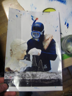
No images on the 'net, so you'll have to go to the White Cube website to see stuff.
Friday, February 06, 2009
David Rayson - Professor lecture series, RCA, Wednesday, February 4th, 2009
Burning Sausage, 2008. Archival ink on paper. 51 by 64 cm. All images from Marlborough Fine Art, where Rayson's The Everyday Fantastic wraps up on February 7th, 2009.
From the Spread Eagle to the Queens,2008. Archival ink on paper. 51 by 64 cm.
The vast selection of drawings are snapshots of a typical day lived by Rayson. As straightforward as the day begins, the ordinary soon gives way to reveal a schizophrenic mash of idleness in the pub, off-license purchases, black and white T.V. movies and the always-present curbside litter. The works themselves are the conglomeration of these everyday objects and experiences. Often working intuitively, Rayson sits down in his studio and responds to his environment. Often what is present in the house alone, or viewable out the window, is enough to get the ball rolling. Throughout his presentation, Rayson showed pictures he had taken of the fanciful constructions his children produce out of their collection of toys. It is from this model of working with what is right in front of you that Rayson constructs all 100 of the works in his latest show.
The tongue-in-cheek approach Rayson takes to life in the suburbs is humourous and lighthearted to some, unsettling to others. When he interrupts an insightful commentary about a group of his work to make false, roughly–stitched together narratives involving Tesco shoppers, trash TV stories of cheaters, and cooking shows, some cannot but feel that he may be mocking a lifestyle some in the audience strive for, if not already comfortably enjoy.
These stories he describes as cyclical. Everyday presents new possiblities; new realities, even. As such, his works are not planned out, but directionless and fed whatever is available until the work is complete. The next day is as unpredictable and alchemical as his work, and dark days, it appears, are as natural as innocent ones. The occasional BBQ fire, common birdlife, and ever-present empty beercans, can sometimes become clouded by a more sinister side of suburbia. Rayson made a point to mention that, try as you may, sometimes you fish all day without a bite. This reality is illustrated in the work, Fishing the Coalhole. In it, a fisherman sits surrounded by an awkwardly high-contrast environment clouded by gloom and pollution. It is doubtful that, even if the hunt were successful, landing a catch would be anything but a revolting reward anyway. Luckily, each morning presents new possiblities - plastic bags dancing in trees, commercials full of exotic holiday destinations, and all other constant and unpredictable inhabitants of the suburbs.
Fishing the Coalhole, 2008. Archival ink on paper. 51 by 64 cm.
Flight 747, 2008. Archival ink on paper. 51 by 64 cm.
Music for Neighbours, 2008. Archival ink on paper. 51 by 64 cm
Thursday, January 29, 2009
Artists from the RCA
I should begin by stating that all can be kind of hesistant to talk about their work. They always have the opportunity to not tell the truth about their work, or to skip a question, or to choose which images are shown or not shown.
Anna M. R. Freeman
Her favourite colour is green.
Anna was asked to identify an inspiring artist. She recommended Machael Borremans.
Anna deals with ideas of nostalgia, memory, longing, and anxiety, and how spaces provoke such ideas. The works are meant to be viewed in relation to each other - these works would commonly be displayed as part of an installation. Works typically display a lack of grounding, resulting in a vertiginous space.
Gareth Cadwallader.
His favourite colour is blue
Gareth identified Neo Rauch as an inspiring artist.
Gareth's work is about a lot of stuff. It is quite often autobiographical, resulting in a deliberate, mostly personal collection of signs and symbols. People are allowed to read what they want.
The works are all small and intimate, worked up entirely in oil. Lots of effort is put in to the source material: they are not images all photshopped together, but constructed like a set and photographed.
Subscribe to:
Posts (Atom)